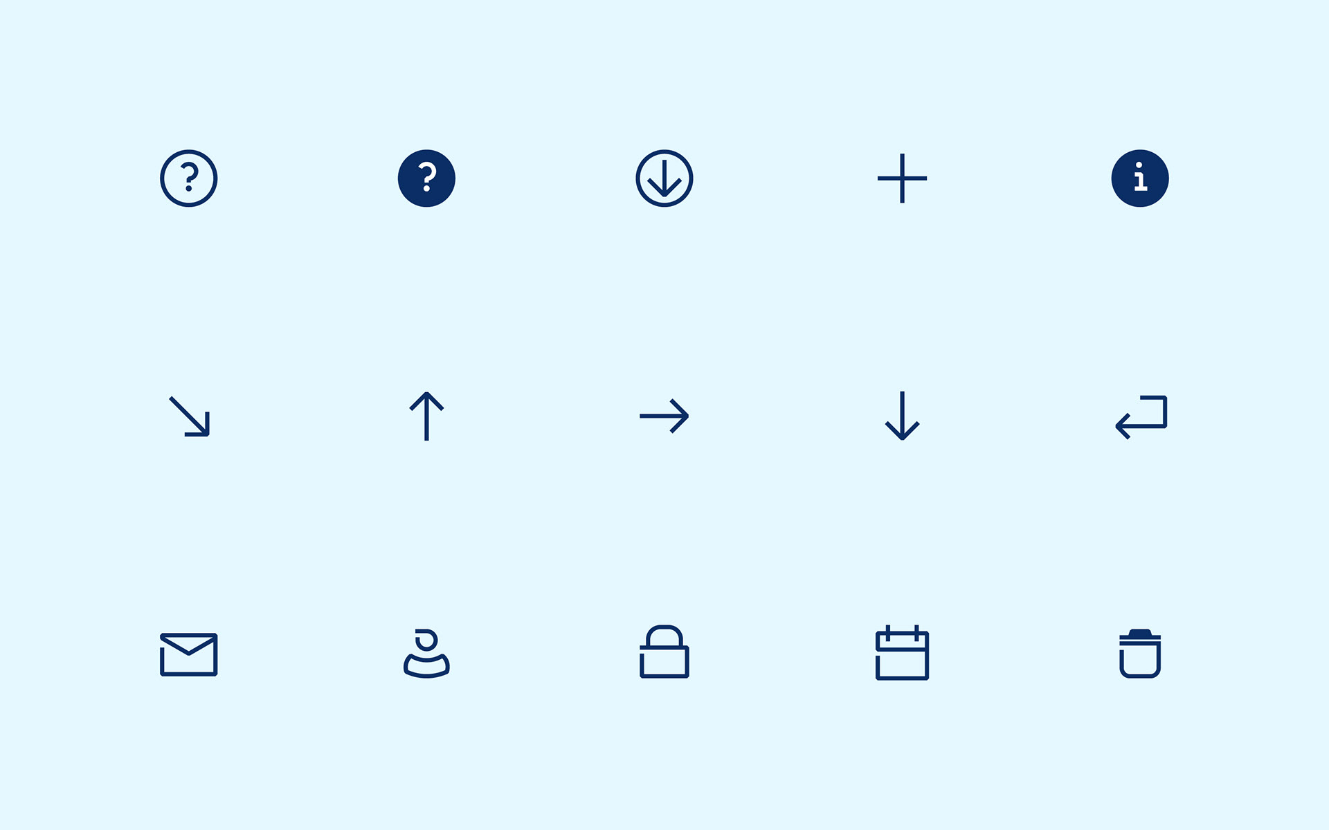
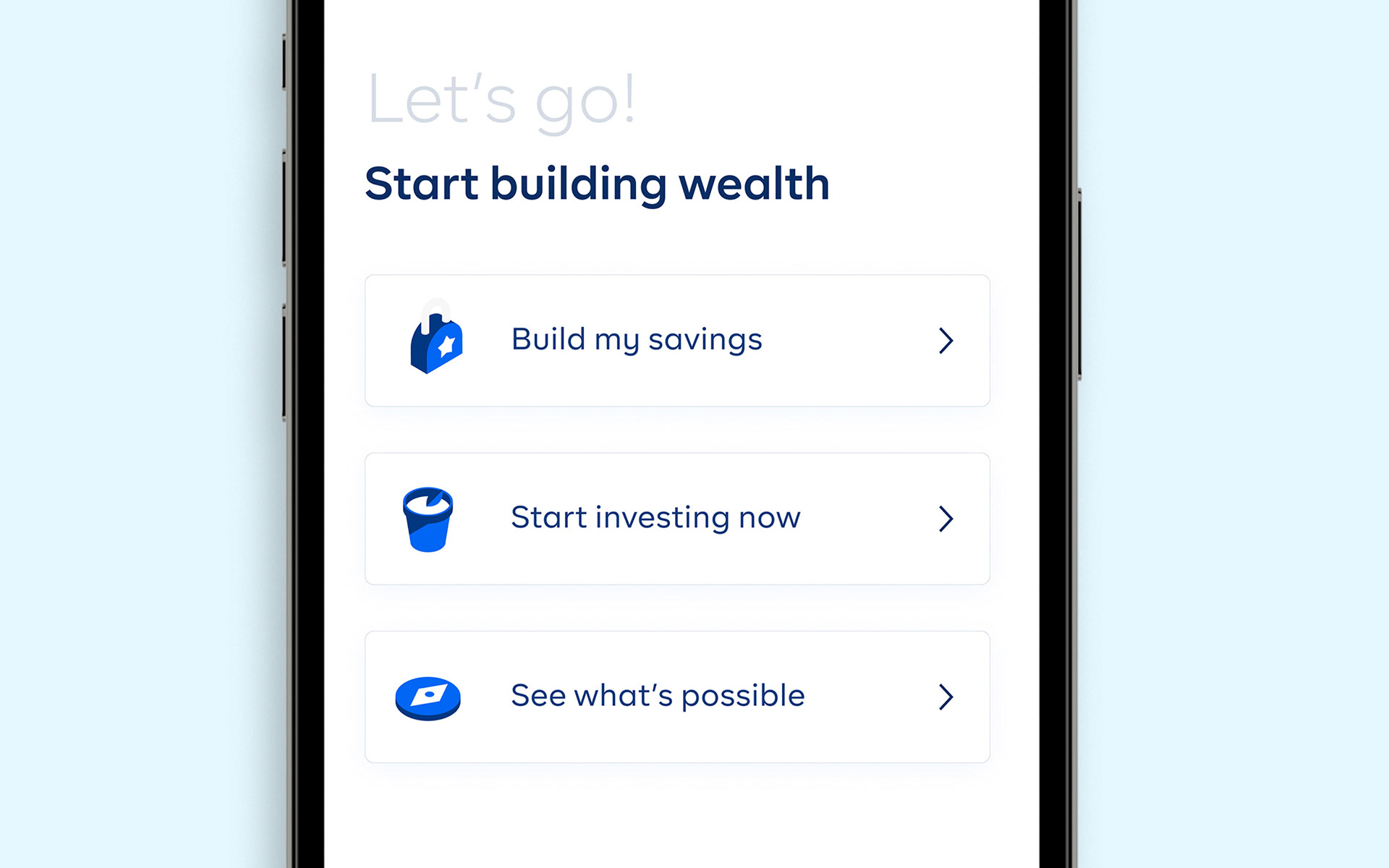
While our icon-set served us well in the past, we identified a need to update them, bringing them in line with the evolution of our visual language.
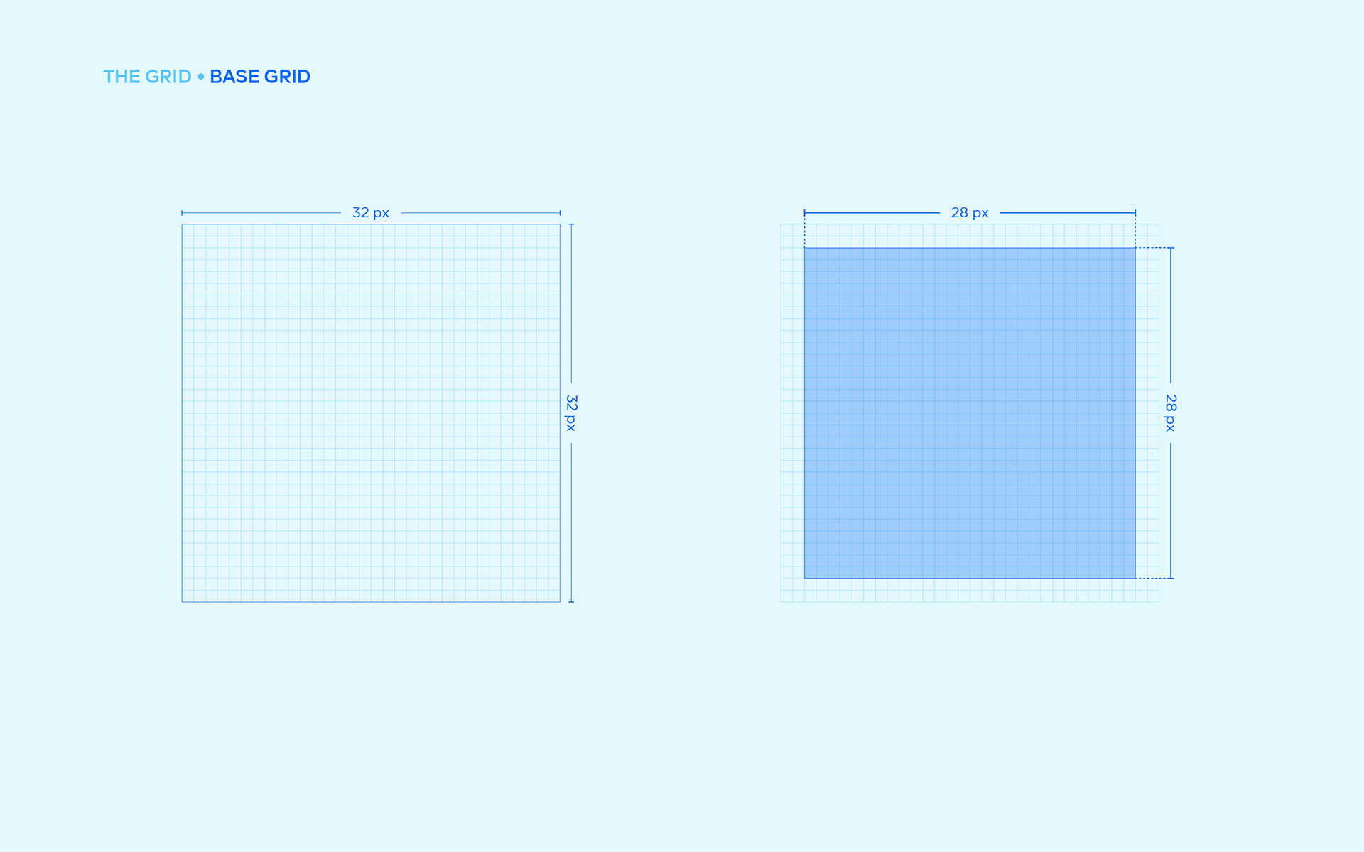
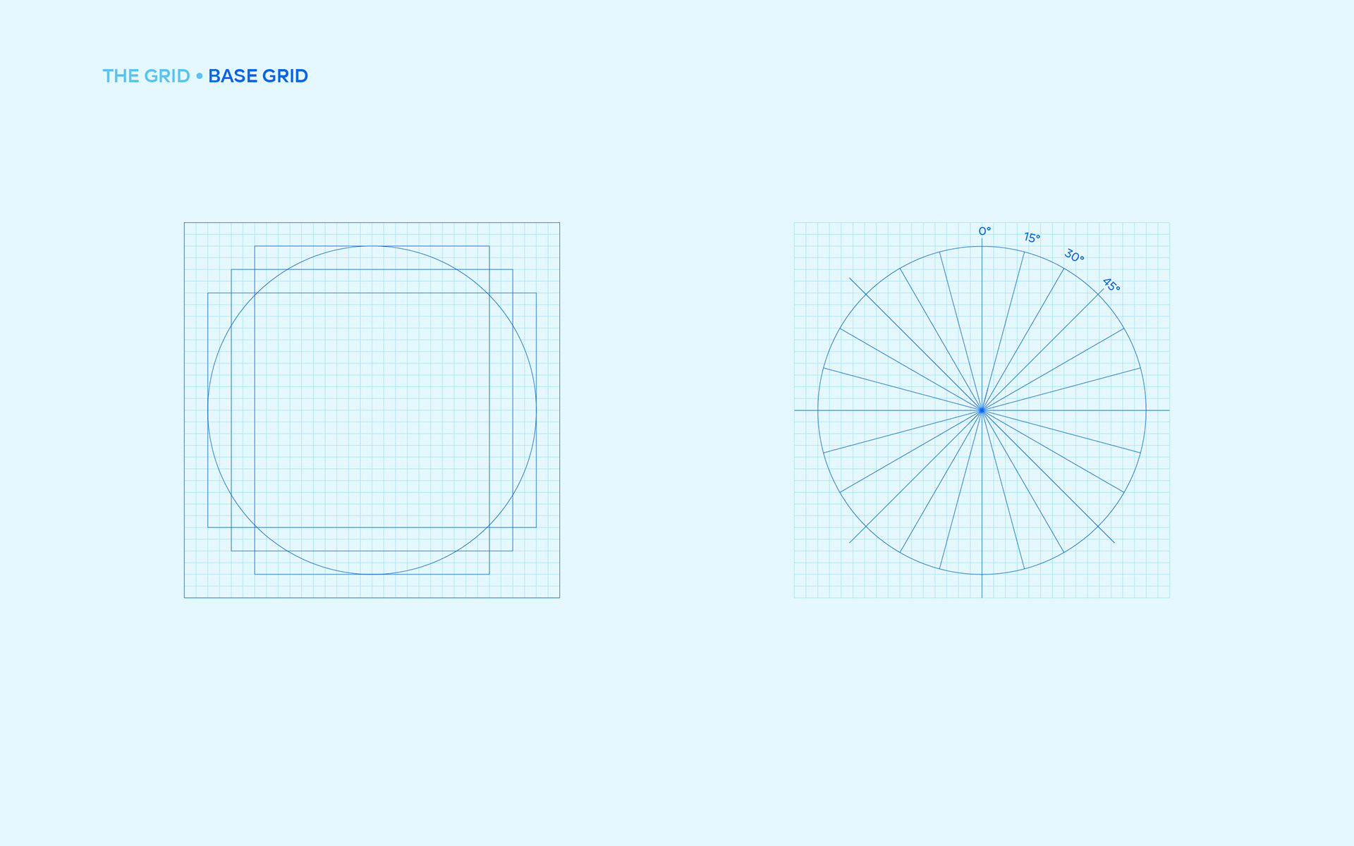
A lot of the icons were inconsistent and had different styles across our ecosystem. Since there was no guide on how to create and use them, managing the quality and consistency of icons was a little bit tedious. As our ecosystem expanded, we realized we needed more and more icons and decided to make the entire icon system feel like one and make it make sense.
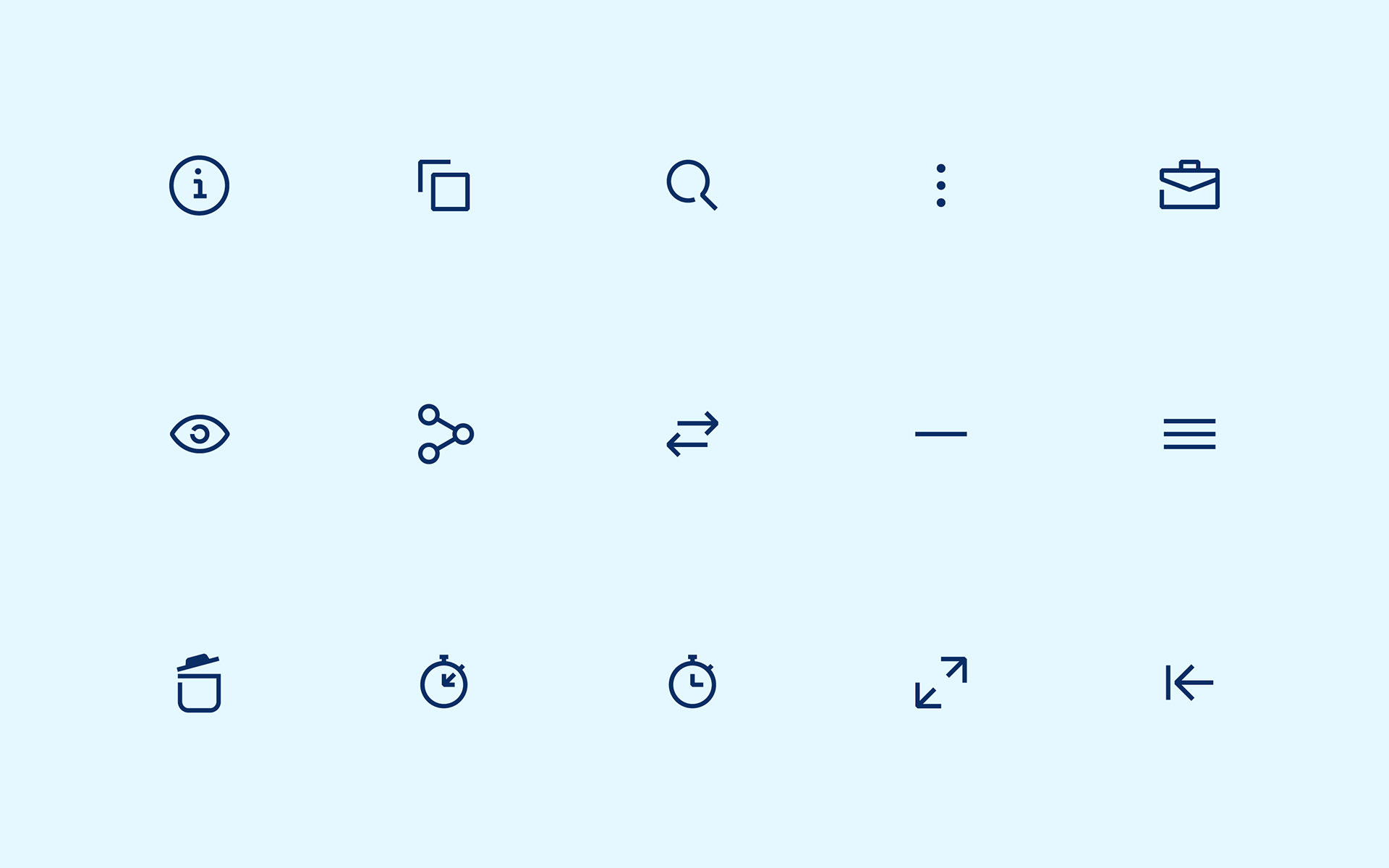
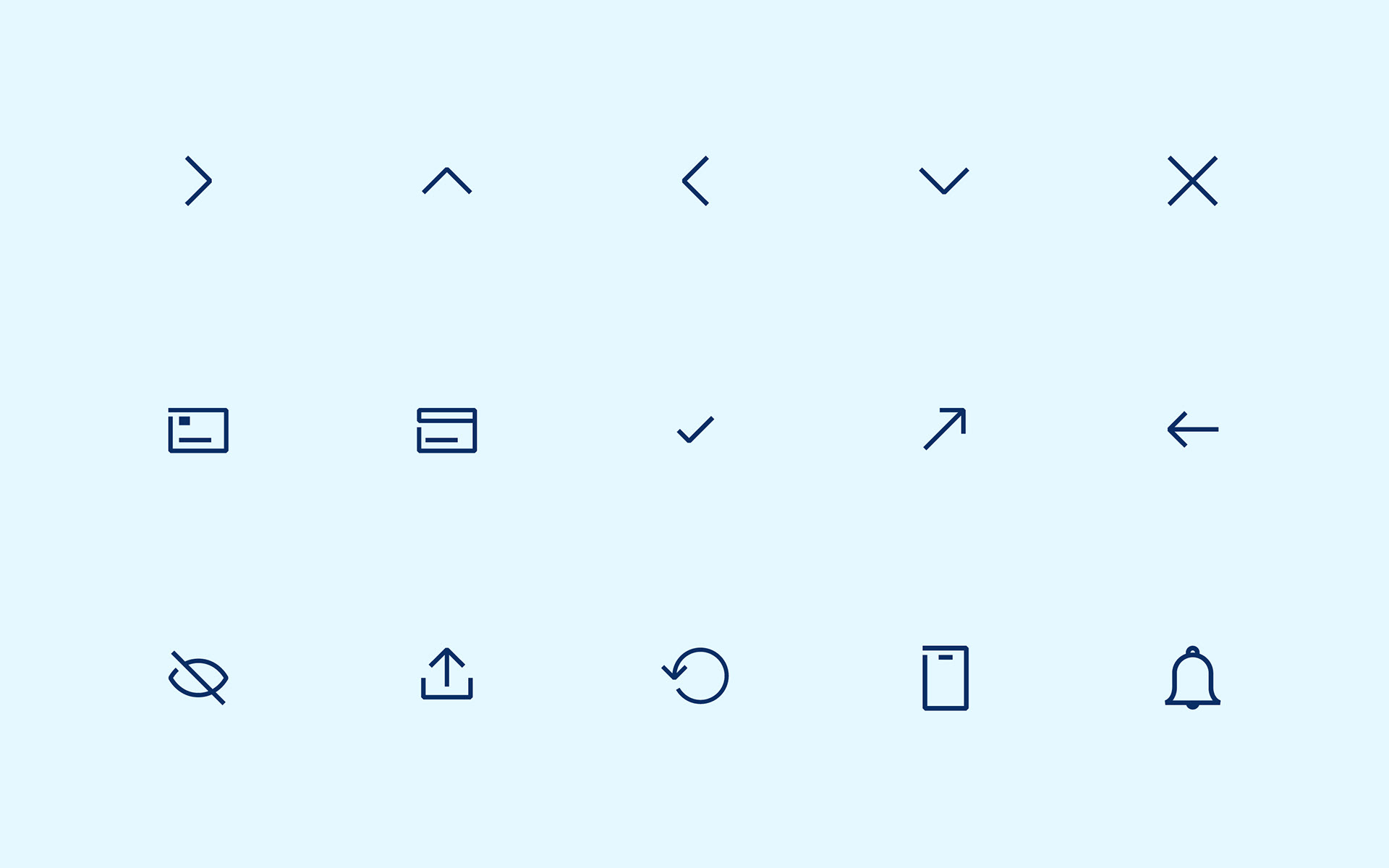
The first thing we did was to analyze the old icon system and picked one of the existing styles (for system icons) — we wanted to keep some form of familiarity. We broke down the sets into three; product and system icons. Using the existing visual language, we created both 3D (product) and 2D (system) icons.
The key difference is that the icons are more beautiful and much more consistent now.
